Supply and Demand
Supply and demand analysis is used by economists to explain the functioning of markets. It shows that the quantity and price of a good that prevail in a market are such that demand equals supply.
Let’s consider Mark, who owns a Toyota Prius and has signed up as driver on a ride-hailing service. He is typically able to service 15 riders per day at an average of $3 per km but on rainy days or when there is a new movie or concert, etc. he serves as many as 20 rides at $3.5 per km. By studying his past experience regarding number of rides he has been able to accept at different locations and times of a day, he has adjusted his work day to maximize his earnings. Even tough there may be hundreds of drivers and thousands of consumers in the ride-hailing market, it all boils down to two words: supply and demand.
Supply Curve/Function
Supply represents the quantity which producers are willing to produce and sell to consumers at different price levels. A supply schedule is a table that shows quantity supplied at different prices. A supply curve is a graphical representation of supply schedule with quantity on x-axis and price on y-axis. Since higher price means that producers have higher profit per unit, they are ready to supply more, the supply curve slopes upwards i.e. at higher price, quantity supplied is high. This inverse relationship between price and quantity supplied is the basis of law of supply which states that quantity supplied increases with increase in price. Supply can also be represented by a supply function, which is a mathematical representation of the relationship between supply of a good, its price, its cost of production, etc.
Let’s say supply in the ride-hailing market on a typical day can be represented by the following supply function:
$$ \text{Q} _ \text{s}=\text{2,500}\ +\text{7,500}\times \text{P}\ $$
If Qs is number of rides supplied and P is the price per km, we can use the function to create a supply schedule:
| Price ($) | Supply |
|---|---|
| 0.50 | 6,250 |
| 1.00 | 10,000 |
| 1.50 | 13,750 |
| 2.00 | 17,500 |
| 2.50 | 21,250 |
| 3.00 | 25,000 |
| 3.50 | 28,750 |
| 4.00 | 32,500 |
This can be plotted as follows as an upward-sloping supply curve in the graph below
Demand Curve/Function
Demand represents the quantity of a good which consumers are willing and able to buy at different prices. Law of demand highlights the fact that people generally buy more of a good when its price is low and vice versa. Demand can be represented either by a demand schedule, a demand curve or a demand function. A demand schedule is a table of quantity demanded corresponding to different prices. A demand curve plots the demand schedule on a graph which has price on y-axis and quantity on x-axis. The demand curve generally slopes downwards as a consequence of law of demand. A demand function is a mathematical representation of the demand curve in that it links the price with quantity demanded and any other variables such as consumer income, etc.
Let’s assume the following function represents demand for rides in the city in which Mark works:
$$ \text{Q} _ \text{d}=\text{50,000}\ -\ \text{10,000}\times \text{P} $$
This can be used to create the following demand schedule:
| Price ($) | Demand |
|---|---|
| 0.50 | 45,000 |
| 1.00 | 40,000 |
| 1.50 | 35,000 |
| 2.00 | 30,000 |
| 2.50 | 25,000 |
| 3.00 | 20,000 |
| 3.50 | 15,000 |
| 4.00 | 10,000 |
Supply and Demand Graph: Market Equilibrium
A supply and demand graph is a diagram which simultaneously shows the demand curve and supply curve and the market equilibrium. It can be used to visually show the relationship between demand and supply. Market equilibrium occurs when supply equals demand. It is the point on the supply and demand graph at which the demand curve intersects the supply curve. The market clearing price (also called equilibrium price) is the price at which quantity supplied equals quantity demanded. The supply and demand graph can be used to visually see how a change in demand and/or supply changes quantity bought and sold in a market and the market price.
The following graph shows supply and demand curves for rides market:
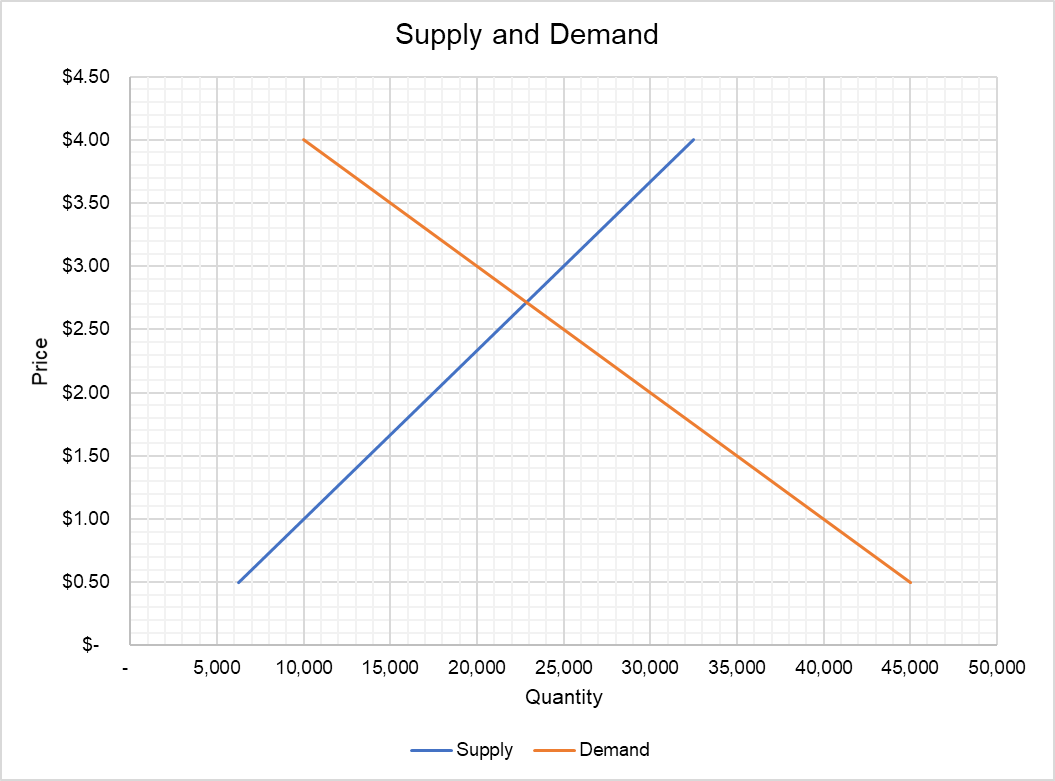
You can see visually that the market clearing number of rides is close to 23,000 at a price of $2.7 per km. We can also use supply and demand functions to work out the exact market clearing quantity and price mathematically.
We know that supply equals demand in market equilibrium:
$$ \text{Q} _ \text{s}=\text{Q} _ \text{d} $$
$$ \text{2,500}\ +\text{7,500}\times \text{P}\ =\text{50,000}\ -\ \text{10,000}\times \text{P} $$
Moving all P terms to right hand side and the constants to left-hand side:
$$ \text{7,500}\times \text{P}\ +\text{10,000}\times \text{P}=\text{50,000}\ -\ \text{2,500} $$
$$ \text{17,500}\times \text{P}\ =\text{47,500} $$
$$ \text{P}\ =\frac{\text{47,500}}{\text{17,500}}=\text{\$2.71} $$
This means that the price that prevails in the market is $2.71
Since we know P, we can use either the supply function or demand function to work out market clearing quantity:
$$ \text{Q} _ \text{s}\ =\text{2,500}\ +\text{7,500}\times\text{2.71}=\ \text{22,857} $$
by Obaidullah Jan, ACA, CFA and last modified on