Yield Curve
A yield curve is a graphical presentation of the term structure of interest rates, the relationship between short-term and long-term bond yields. It is plotted with bond yield on the vertical axis and the years to maturity on the horizontal axis.
A yield curve tells us about the relative cost of short-term and long-term debt and allows companies to not only decide about the structure and timing of their capital structure changes, but it also carries important information about the economic outlook and financial market conditions.
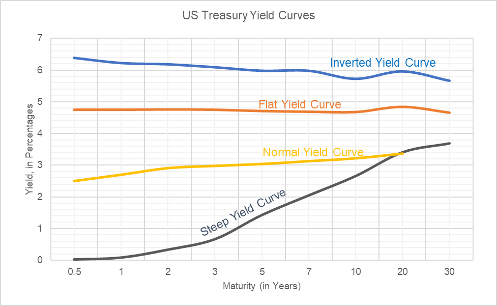
For example, let us consider the following data obtained from US Department of Treasury website regarding yield on US treasuries.
| Date ↓/ Maturity→ | Shape of Yield Curve | 0.5 | 1 | 2 | 3 | 5 | 7 | 10 | 20 | 30 |
|---|---|---|---|---|---|---|---|---|---|---|
| 31-Aug-00 | Inverted | 6.38 | 6.22 | 6.18 | 6.09 | 5.98 | 5.98 | 5.73 | 5.96 | 5.67 |
| 03-Mar-06 | Flat | 4.75 | 4.75 | 4.76 | 4.75 | 4.71 | 4.69 | 4.68 | 4.84 | 4.66 |
| 26-Sep-13 | Steep | 0.03 | 0.09 | 0.34 | 0.67 | 1.43 | 2.05 | 2.66 | 3.41 | 3.69 |
| 11-Feb-18 | Normal | 2.5 | 2.7 | 2.91 | 2.98 | 3.04 | 3.13 | 3.22 | 3.37 | 3.46 |
If we plot these on a graph, we get the following diagram. This is called the yield curve.
Types of yield curves
Yield curves differ primarily based on their underlying type of yield i.e. treasury yield, corporate bond yield, etc.
There are four classifications of yield curves depending on their shape: the normal yield curve, the steep yield curve, the flat yield curve, and the inverted yield curve.
Normal yield curve
In general, long-term yields are typically higher than short-term yield due to the higher risk involved in long-term investment. Since this is the most common shape of the yield curve, it is called the normal yield curve.
The short-term yields are heavily influenced by central banks such as US Federal Reserve and the long-term yields are a function of the expected short-term interest rates in future and the market’s assessment of the inherent risk.
Normal yield curve typically exist when an economy is neither in a recession nor there is any major risk of overheating. The yellow curve in the chart above which corresponds to 2018 is an example of the normal yield curve.
Steep yield curve
A steep yield curve is the one in which the short-term yields are at normal level, but the long-term yields are higher.
A steep yield curve signals that the interest rates are expected to be increase in future. This is represented by the black line corresponding to a period in 2013.
Flat yield curve
A flat curve is one in which there is no significant difference between yields on short-term and long-term debt. Since the long-term yield is lower than normal, a flat yield curve signals a slow-down in the economy and a decrease in interest rates.
When the yield curve is flat, no one would want to obtain long-term debt because they expect interest rates to fall. It is a precursor of recession.
Inverted yield curve
An inverted yield curve is just opposite of the normal yield curve (therefore, it is also called abnormal yield curve). When the yield for shorter maturities is higher than the yield for longer maturities, the yield curve slopes downward and the graph looks inverted.
As evident by the blue curve in the chart above, it occurred in 2000 during the dot com bubble.
Yield curve theories
There are different theories that attempt to explain the different shapes of the yield curve, namely, the pure expectations theory, the liquidity premium theory, the market segmentation theory, and the preferred habitat theory.
Pure expectations theory
Pure expectations theory (also called expectations theory or unbiased expectations theory) contends that the long-term interest rates differ from short-term interest rates because financial market participants have different expectations regarding interest rates and inflation in the short-run and long-run. According to expectations theory, yield curve is normal when interest rate and inflation rate are expected to increase in future and vice versa. Expectations theory forms the basis of the bootstrapping approach used to identify forward interest rates.
Liquidity preference theory
The liquidity preference theory is based on the premise that all investors prefer short-term horizon because long-term horizon carries higher interest rate risk. It postulates that investors must be compensated with a higher return on long-term investments.
Even though the liquidity preference theory explains the normal yield curve, it does not offer any guidance on why inverted or flat yield curves exist.
Market-segmentation theory
The market-segmentation theory supports the notion that separate demand and supply determinants exists for short-term and long-term securities and their interplay in distinct markets determine the shape of the yield curve.
For example, a pension fund might be interested in only such fixed-income securities whose duration matches the duration of its liabilities. Since every market player is constrained by his own requirements, he had demand for or supply of instruments of specific maturity. If the demand for long-term capital is higher than its supply, the long-term rate will be higher and so on.
Preferred habitat theory
The preferred habitat theory is similar to market-segmentation theory in that it suggests that different market participants have different willingness and ability which dictates their preferred maturities.
However, it does not require the distinct markets assumption rather it presumes that investors are willing to go out of their preferred habitat (preferred maturities) if doing so would result in higher risk-adjusted return.
by Obaidullah Jan, ACA, CFA and last modified on